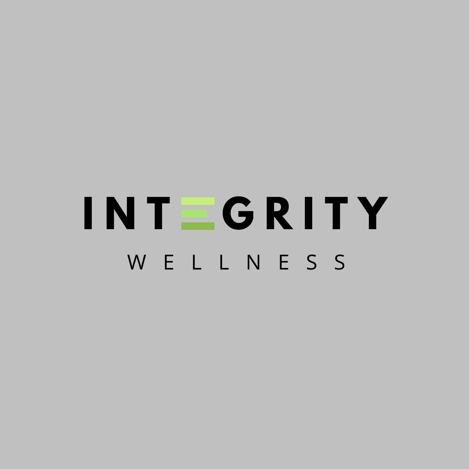
Logo Concept 1
This concept communicates the words “boldness, integrity, modern and confident” when I look at it. The font used in concept #1 is League Spartan. This font is a new classic, bold, and modern font, which is what I feel Integrity Wellness is going to be. I loved incorporating the colors you had mentioned of black, white, lime green, and gray. I gave two different versions of this so you could see what it would look like on top of different backgrounds, depending on what it’s used for. I love the “E” — it is very unique and hard to forget.
The subtext on this concept is “Open Sans” — so the headlines “Integrity” communicates boldness and confidence, while this subtext “Wellness” is more friendly and welcoming.

Logo Concept 2
This one is very similar to concept 1. It uses the same font, League Spartan, in both the headline and subtext. This one is a little more bold to me. It still has the unique “E” in the middle, which I think is so engaging and powerful. I did add a gradient over these so you could see what they would look like in different settings.


Logo Concept 3
This concept communicates “growth” and “progress” to me. Meaning, I see it and realize that this company would help me grow in some way. I used the same League Spartan font for both the headline and the subtext for this. Instead of incorporating the boxes as an “E”, I instead made it as a symbol for the “stepping stone” you provide people for better health.

